The Redesign Kunsthalle Leipzig project was developed by CTP – Conversation Taking Place with the goal of refreshing the visual identity and exhibition design of Kunsthalle Leipzig. This redesign focuses on modern aesthetics and enhanced visitor engagement, reflecting the institution’s commitment to contemporary art.
A key aspect of the Redesign Kunsthalle Leipzig is the creation of a cohesive visual language that unifies all communication materials. The redesign employs bold typography, dynamic layouts, and a flexible color palette to highlight the diversity and innovation of the Kunsthalle’s programming.
Alongside the visual identity, the redesign includes a fresh exhibition concept that optimizes visitor flow and interaction with artworks. This approach enhances the overall experience, encouraging deeper engagement with contemporary art.
At CTP, we specialize in projects like the Redesign Kunsthalle Leipzig, where we merge graphic design, spatial planning, and cultural understanding to create immersive and meaningful art spaces.
For more details on Kunsthalle Leipzig, visit kunsthalle-leipzig.de. Explore more about our design work on CTP’s homepage.
CTP. TP. P. Notifications – Tue 13 Aug 2024
Redesign Kunsthalle Leipzig
In July 2022, we started our conversation with Tanja Heuchele. As the artistic director and curator of ‘a&o Kunsthalle Leipzig’, she’s running the art space with generous support of a&o Hostels in providing the location next to the central station and former home to the Leipzig Post Office.
Reading Time 8 min
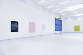
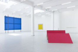
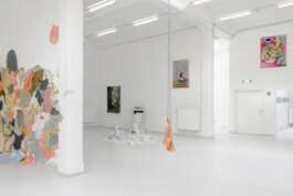
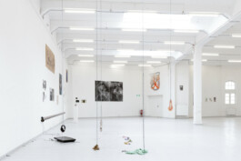
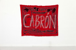
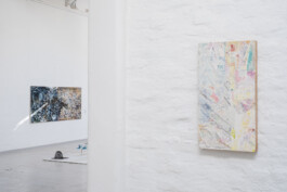
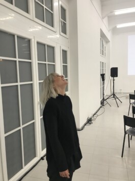
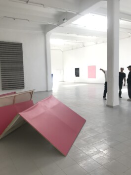
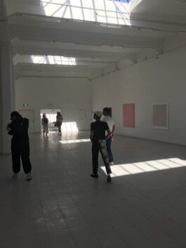
Tanja and I began our first conversation around June 2022. Looking back, it felt like I had just graduated from art school, although in reality, I had been back in Berlin for a few years. I remember feeling a strong drive, almost a personal mission, towards the redesign of the Kunsthalle. During my brief time in Leipzig, where I finished my diploma, the Kunsthalle was still relatively new but incredibly exciting to me in terms of the space and its potential. In my student eyes, it embodied the perfect dream of an art space. There was something captivating about the space from the moment you first entered, reminiscent of what you might expect from larger institutions or even something you’d find in New York. Back in university, the Kunsthalle was the stuff of dreams when it came to exhibiting one’s work. Entering its almost overwhelmingly large exhibition hall left a lasting impression.
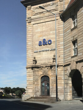
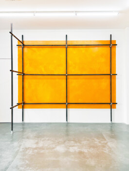
Leipzig is well-known for its densely packed art district, represented by a mix of small, mid-sized, and heavyweight galleries, located on the opposite end of the city. At the time I was living there, I saw this as a significant asset for the city, but also as something somewhat ‘shut off’ and ‘kept private’ from the broader society. Naturally, I was curious to see how the Kunsthalle would position itself within this established art scene, yet distinct from the rest of the city. I hadn’t expected such a space from Leipzig, especially as a student who frequented all sorts of on- and off-brand galleries and art spaces.
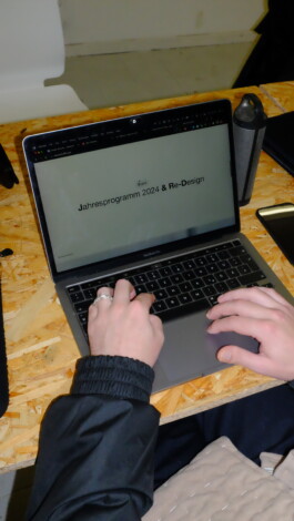
After moving back to Berlin and setting up my studio, I occasionally returned to Leipzig and kept up with developments at the Kunsthalle. To my surprise, it hadn’t developed a cohesive graphic identity over the years, which seemed out of sync with the impressive space itself. Eventually, this led to my conversation with Tanja, where we exchanged ideas about a complete rebranding—or rather, creating an identity from scratch. We quickly delved into how the Kunsthalle had reached this point of being a significant art space without a defined identity, and what we hoped to achieve through our work together. The conversations were exciting and energized us to tackle the many tasks ahead. We developed a strong understanding of each other’s work and perspectives, a connection that has continued throughout our collaboration and ongoing projects.
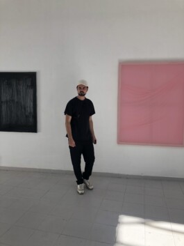
Starting from scratch, due to the inconsistent or non-existent identity, meant it was crucial to reflect on the history of the Kunsthalle and the work they had done over the years. This was both a blessing and a challenge. In many ways, it was a luxurious situation to be in. Typically, design work with a client begins either at the very start without any history, or with a well-established heritage that needs reconsidering and rebranding. Our situation was unique in that we had years of exhibitions and curated shows to build upon, but no coherent identity or branding elements—aside from a logo that was more formal than expressive.
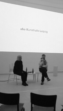
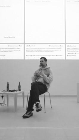
The main challenge in our initial explorations was uncovering the core ideas and visions for the art space. From there, it became clear that the visual journey would focus on the Kunsthalle as a space for individuals and groups, mainly providing a platform for emerging artists to test their ideas and gain experience in a large, professional setting.
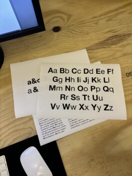
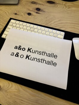
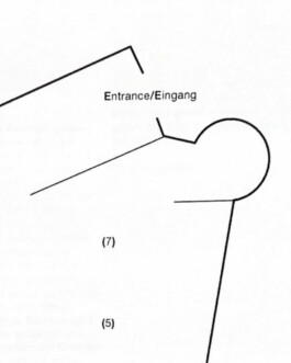
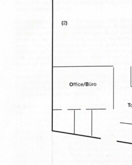
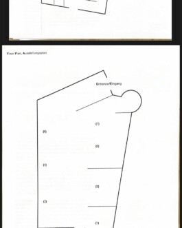
We had great respect for each other’s expertise, which made it easy to trust one another as we explored and discovered our visual path. I was fortunate to build a small team, including graphic designer Lucie de Brechard, who joined the project and significantly contributed to creating the overall identity. The design process demanded careful attention not only to aesthetics but also to the inventive ways the identity could enhance the Kunsthalle. We knew the Kunsthalle needed something highly recognizable yet simple. Beyond creating a logo system, floor plans, posters, and a website, we emphasized a typographic system that was unique to the Kunsthalle but easily replicated on any computer with standard fonts. This approach ensured that the Kunsthalle had a tool for visual recognition at any time, while also making the identity accessible and adaptable.
In addition to the visual identity, we made structural changes influenced by the design, aimed at optimizing workflows and processes within the team and in collaboration with the artists. A welcome challenge was developing a new method for consistently collecting information from all artists involved with the Kunsthalle. With over 300 artists having exhibited there over the past three years, it was no surprise that the information collected was inconsistently structured. Since the Kunsthalle dedicates specific sites to each artist on their official page, it took considerable effort to find a convenient and applicable way to gather and display this information for the staff. The project was filled with small inventions and easy-to-implement mechanisms that had a significant visual impact. There is a certain beauty in finding elegant ways to automate individual processes.
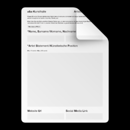
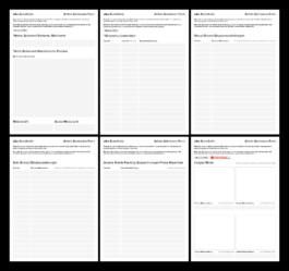
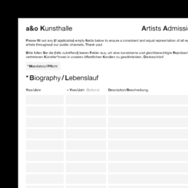
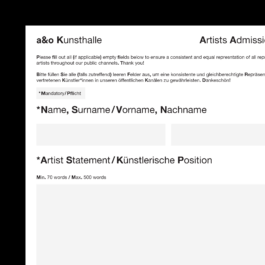
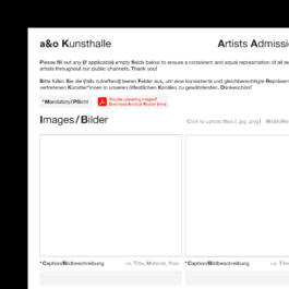
One solution for managing large amounts of information was to develop a smart PDF document. This document could hold detailed information and image materials, with upload areas that combined various types of data from all artists into a streamlined form. Often, institutions receive scattered information from collaborators, which poses a challenge in processing it in a structured way. For us, it was crucial to find an easy solution not just for the Kunsthalle, but also for the artists who would need to submit their information.
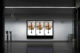
Additionally we also had to tackle another common challenge: image material. In most cases, we anticipated dealing with low-quality images or no images at all, given that the Kunsthalle often promotes relatively inexperienced artists or even students who may not have the best documentation readily available. While this issue could easily be addressed with a strong typographic concept—which we already had—we didn’t want the Kunsthalle’s identity to be just another black-type-on-white-background approach.
We drew inspiration from a technique used on social media platforms, where profile pictures are blurred to either conceal an identity or spark curiosity, prompting users to engage further. We applied this concept to our graphic design, solving two main challenges:
Mysterious Appeal: The blurred image layer introduced an element of mystery, generating curiosity about the artists and their work, while also resonating with the idea of the ‘yet-unknown’ artists. Our initial concept was to use only blurry portraits, creating a persona that would need to be ‘unlocked’–and therefore un-blurred–by visiting the exhibition. However, this quickly evolved into using all kinds of materials provided by the artists within the context of their upcoming shows.
Flexibility with Quality: This approach gave us the freedom to work with various levels of image quality, allowing us to handle whatever materials the artists provided without imposing strict demands on them. This was particularly important, as we wanted the artists to focus on preparing for their upcoming shows rather than worrying about meeting high expectations for image submissions. By addressing this practical challenge, we not only solved a real-world issue but also added a visually intriguing element to the identity.
As a result, we created a design that combines a strong typographic foundation with a mysterious image layer, effectively balancing the act of decoding and encoding messages for the viewer.
