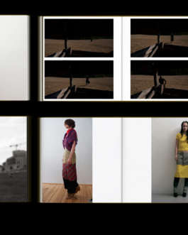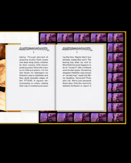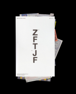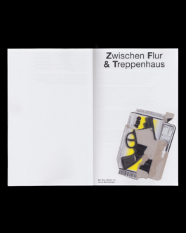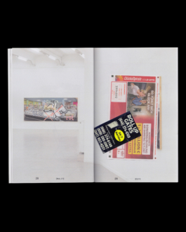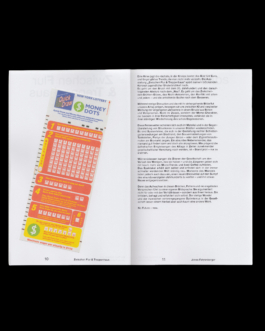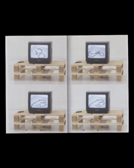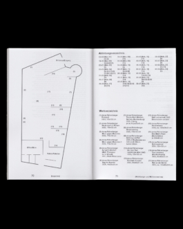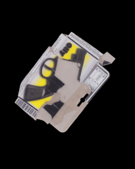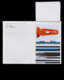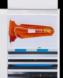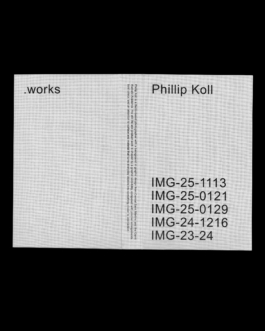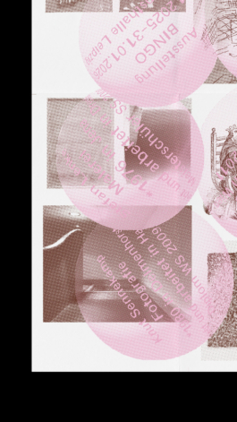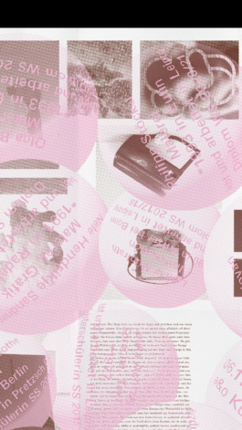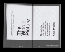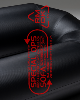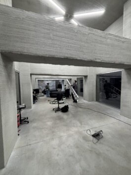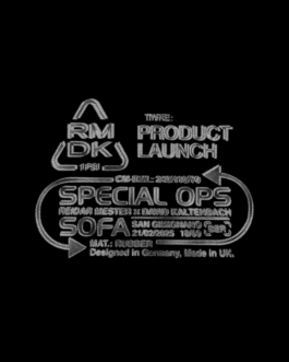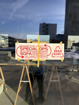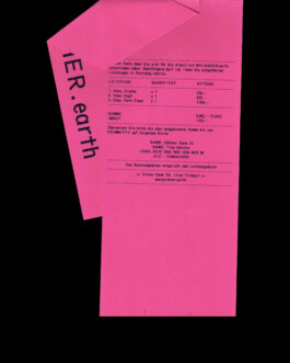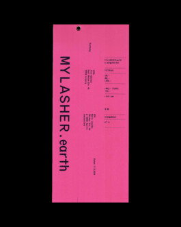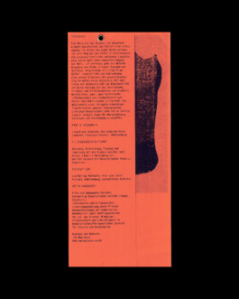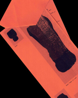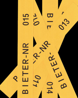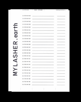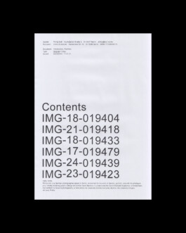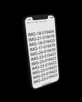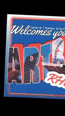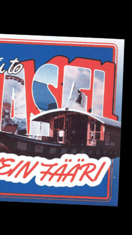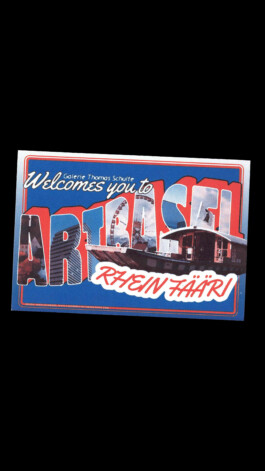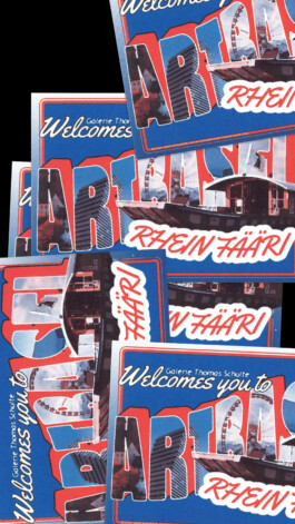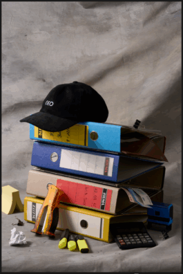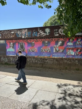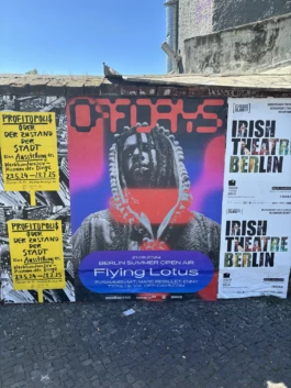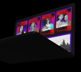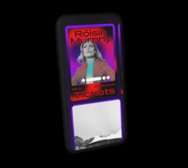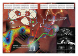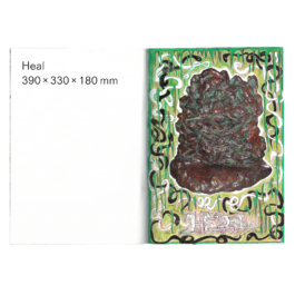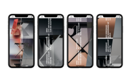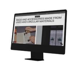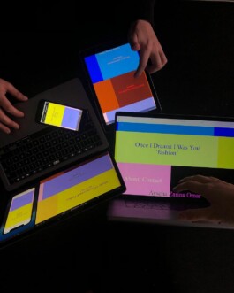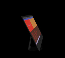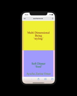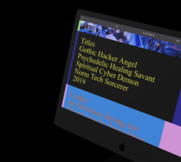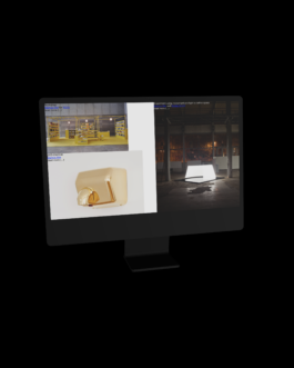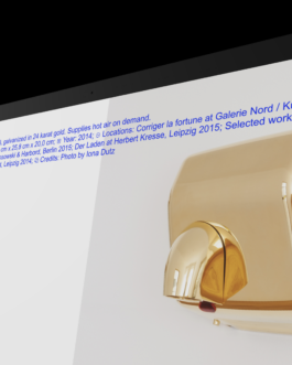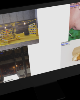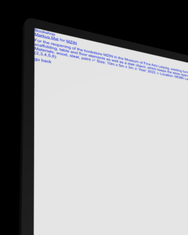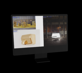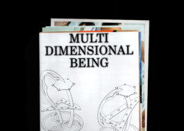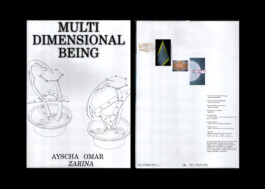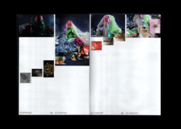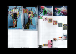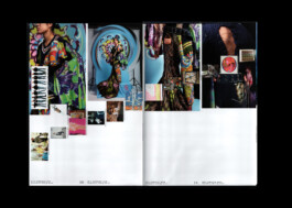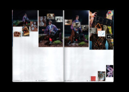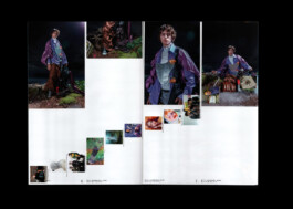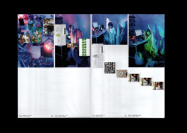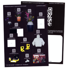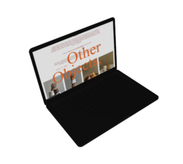
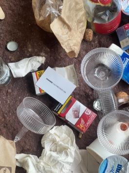
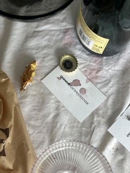
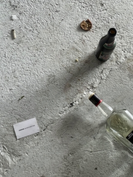
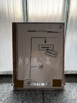
From the late 1960s through the early 1990s, art world announcements, invitations, and advertisements shared a common visual language, each one calibrated to its own work, gallery, and moment. This new identity steps into that same tension, a typographic gateway to the culture of making and showing art, reactivated for a studio as varied and consistent as the art world it speaks to.
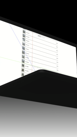
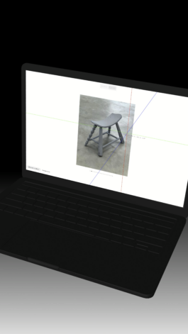
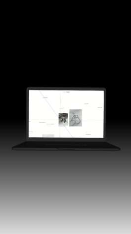
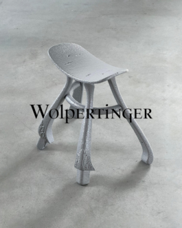
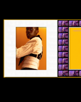
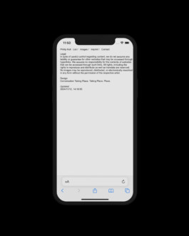
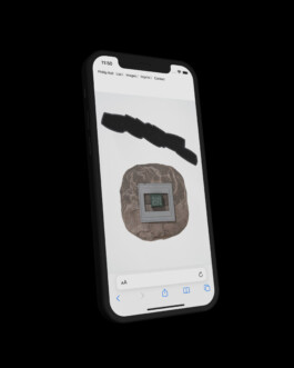
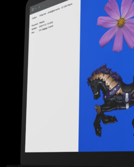
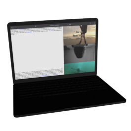
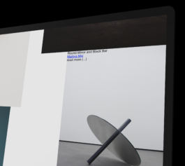
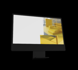
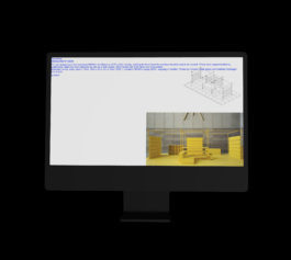
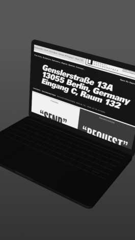
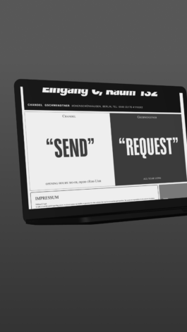
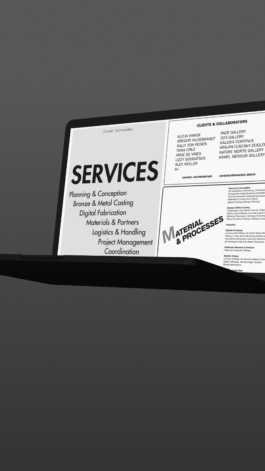
For Matthias Gschwendtner's new website, CTP. TP. P. developed a visual and navigational language that reflects the tension at the core of his practice. Between strict method and open outcome. Between the precisely defined and the completely unexpected.
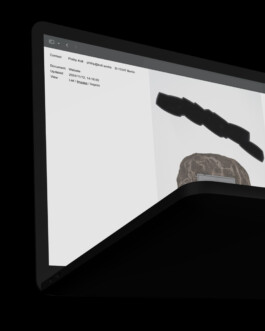
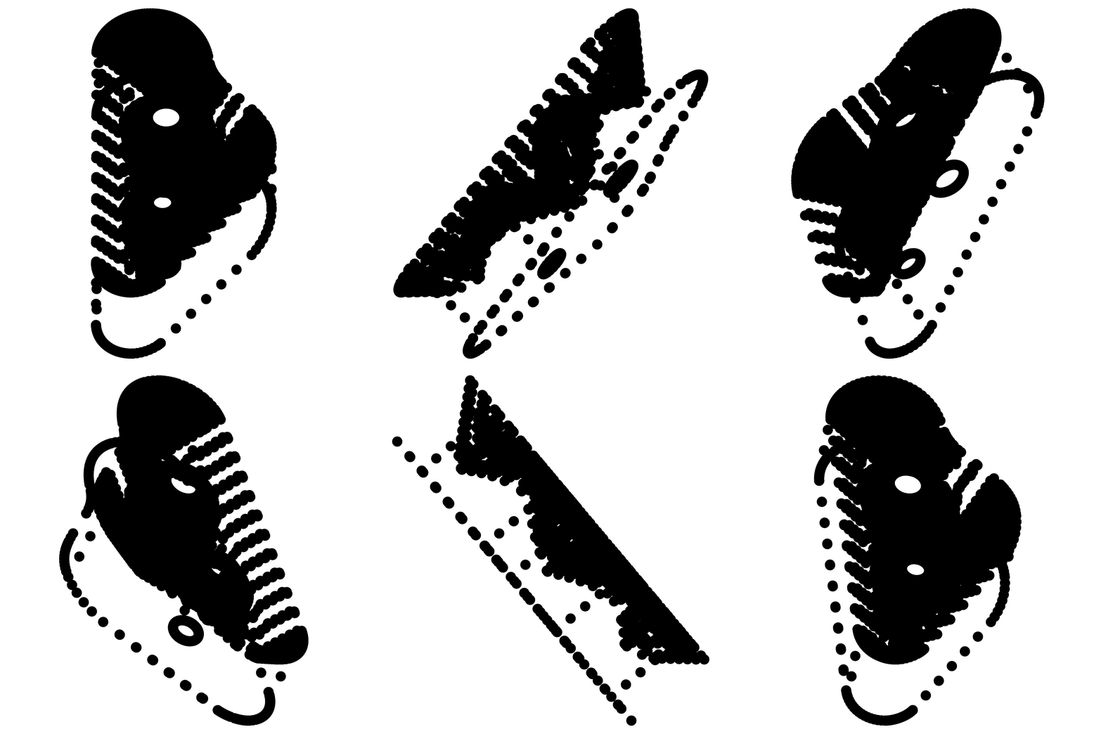
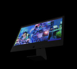
A custom typeface and a special XYZ cursor developed specifically for this project draws on the logic of vintage technical software and introduces a sense of three dimensionality into the flat space of the web interface. The homepage operates as an unlimited room where projects scatter freely, and yet precisely located by navigational tools.