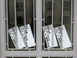
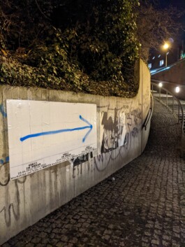
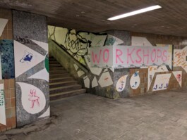
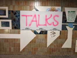
A visual identity for Kunst im Umbau—a two-day workshop and talk series on Art and (Re)Construction. Inspired by construction sites, we developed a variable typeface built from stacked elements, paired with spray-painted signals that echo the event’s raw, performative energy.
Visual Identity, Workshop and Talks at MUCCA, Munich (…)
< go back
The Kunst im Umbau Workshop is a two-day event featuring a series of talks that bring together diverse artistic perspectives around the theme of Art and (Re)Construction. Since it is heavily inspired by construction sites and the presence of large piles of materials, the workshop explores the performativity of signalling and its role in shaping visual identity.
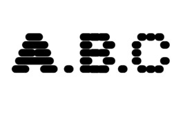
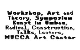
Drawing from the visual clues found in construction sites, the workshop’s design includes a variable typeface created by piling individual elements to form letters. Additionally, spray paint was used throughout the event to address different needs and applications, thereby reflecting the dynamic and multifaceted nature of construction environments.
The Kunst im Umbau Workshop fosters dialogue among artists who engage with themes of building, transformation, and reconstruction. Moreover, the performativity of signalling becomes a central motif, shaping the event’s identity and emphasizing the visual language of construction zones.
Organized in collaboration with CTP – Conversation Taking Place, the workshop highlights the intersection of art, design, and social processes involved in (re)construction. Furthermore, the event was supported by Mucca, an organization dedicated to promoting artistic and cultural projects. This collaboration enriches the conversation around contemporary art practices and their relation to space and transformation.
Explore more on CTP’s homepage.
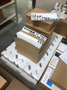
Kunst im Umbau is a two day workshop and a series of talks. The event gathers around different artistic positions relating to the topic of Art and (Re)Construction.

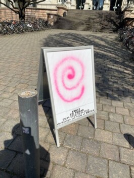
Heavily inspired by construction sides and the obligatory appearance of huge piles of material, the performativity of signalling shapes this identity and builds on the visual clues of such places. Therefore we created a variable typeface by piling up individual elements to shape letters, and by using spray paint to identify the various needs and applications of the event.
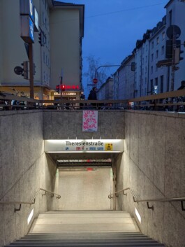
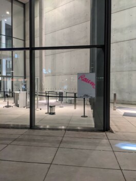
Photos by Ursula Gaisbauer
Also look at (…)