OFFDAYS Music Festival
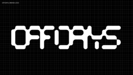
A distinct customised logotype with a clear visual identity spanning from digital to print applications. A newly launched festival brand designed to take place in different locations during two to three days.
Festival Identity, Art Direction & Design for OFFDAYS (…)
further links: www.off-days.com
< go back
The Offdays Festival Visual Identity was created by CTP – Conversation Taking Place, an independent design studio based in Berlin. The identity system supports the 2023/24 editions of the Offdays Festival with a modular and bold graphic approach that reflects the energy and flow of the programme.
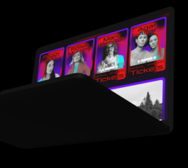
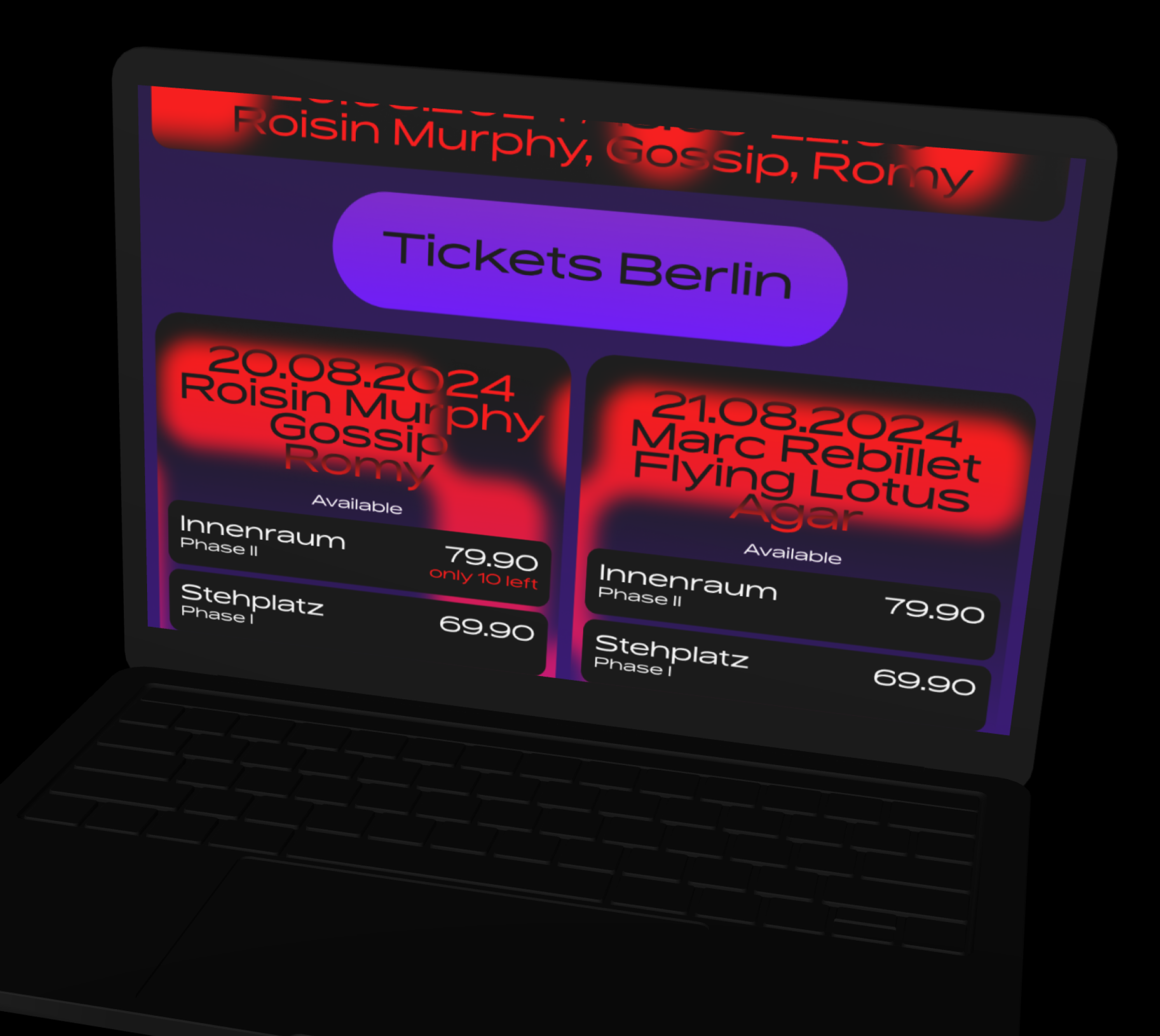
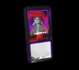
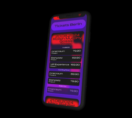
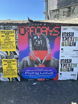
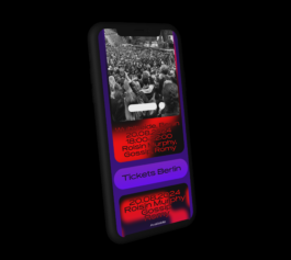
Our visual identity for Offdays builds on a strong colour logic, so each edition feels distinct but connected. We developed a modular toolkit of visual assets—including posters, signage, animations, and web graphics—that maintain consistency across all channels.
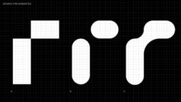
The Offdays Festival Visual Identity uses geometric forms and high-contrast palettes to support clarity, while expressing the experimental spirit of the event.
Every visual asset is driven by a modular system: colour blocks, simple typography, and layout rhythm. This applies to social media templates, schedule posters, and digital screens. Because the event includes multiple venues and formats, modularity ensures cohesion and adaptability.
Typographic consistency supports the flow of information, while the colour palette serves both branding and navigation functions.
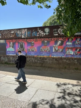
The identity extends into visitor experience through maps, signage, and physical applications. Wayfinding materials follow the same graphic language, so audiences stay oriented across spaces. The visual system is engaging but never overwhelming.
We also developed assets for merchandise and handouts—badges, stickers, printed maps—so the identity becomes tangible.
At CTP, we specialize in visual identities for festivals, events, and public programmes. Our process involves research and visual systems thinking, so each project remains consistent across multiple channels and editions.
The Offdays Festival Visual Identity reflects our commitment to building immersive and modular brand experiences.
Explore more of our work on CTP’s homepage. For more on the Offdays programme and upcoming editions, visit offdaysfestival.de.
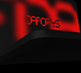
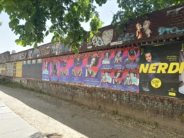
A distinct customised Logotype with a clear visual identity spanning from digital to print applications. A newly launched festival brand designed to take place in different locations during two to three days.
Also look at (…)