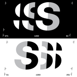
A special typeface designed for the eponymous performative art installation of ‘P.G.’. Making use of ‘contextual alternates’and the design of two additional versions of each letter of the alphabet, the typeface creates a logo look kind of feel for all words written.
Typedesign, Pauline G., Artworks, Berlin (…)
< go back
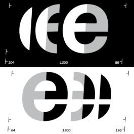
The NPCU Typeface Design is a specially crafted font created for the eponymous performative art installation by the artist P.G. Developed by CTP – Conversation Taking Place, this typeface incorporates unique design features such as ‘contextual alternates’ and includes two additional versions of each letter of the alphabet. These elements combine to produce a logo-like effect for all the written words within the installation.
Designed to complement P.G.’s extensive performance installations, the NPCU Typeface Design reflects the themes of sport and performance. The typeface enhances the visual identity of the artworks by providing a distinct and dynamic typographic presence that resonates with the performative nature of the project.
The NPCU Typeface Design is further developed from the base of ‘Diatype Mono,’ a typeface created by Abc Dinamo. This foundation allows the font to maintain a clean, monospaced structure while incorporating custom modifications that suit the artistic vision of P.G.’s installation.
At CTP, we specialize in designing bespoke typefaces that elevate artistic projects and performances. The NPCU Typeface Design exemplifies our commitment to blending typography with conceptual art to create memorable visual identities.
Explore more on CTP’s homepage. Learn more about Diatype Mono at abcdinamo.com.
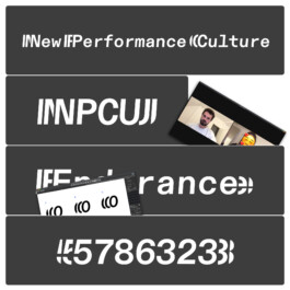
‘NPCU’ is a special typeface designed for the eponymous performative art installation of ‘P.G.’. Making use of ‘contextual alternates’¹ and the design of two additional versions of each letter of the alphabet, the typeface creates a logo look kind of feel for all words written.

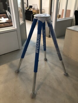
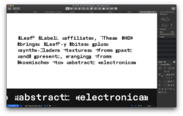
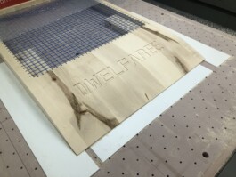
A typeface created to match P.G.’s extensive performance installations, showing diverse custom made artworks dealing with the topic of sport and performance. The typeface is further developed based on ‘Diatype Mono’ by Abc Dinamo.
Design Team: Immo Schneider, Nathalie Golde
Artworks: P.G.
Photography: Joseph Kadow
Video animations: Nathalie Golde
