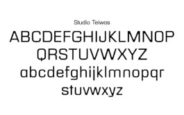
The Studio TEIWAS Typedesign project was created by CTP – Conversation Taking Place to develop an experimental typeface and visual identity. This design combines typography and graphic expression to reflect Studio TEIWAS’s innovative approach.
The typeface uses abstract forms, dynamic shapes, and unconventional layouts to create an expressive visual language. The Studio TEIWAS Typedesign embraces experimentation, blending legibility with artistic freedom.
Modular grids guide the layout, ensuring consistency, while typographic elements introduce rhythm and texture.
The project extends beyond typography to include graphic elements that complement the typeface. This cohesive visual system applies to print, digital media, and environmental graphics, making the identity versatile.
Typography balances clarity and visual impact, while allowing playful nuances that match Studio TEIWAS’s ethos.
This typedesign project contributes to ongoing dialogues between graphic design and experimental typography. It invites audiences to experience a brand identity that challenges traditional forms while maintaining communication effectiveness.
At CTP, we specialize in typographic projects that explore form and function. If you want to create a type system that is both conceptual and practical, we offer tailored design strategies.
Explore more on CTP’s homepage. To experience Studio TEIWAS’s typedesign in context, visit their online presence.


Studio Teiwas
A modern take on the infamous typeface ‘Eurostil’, with a care for the next level of modernity and some unusual moments softening its technicality with a humanistic approach.
Typedesign, Robert Dietz, Studio Teiwas, Sounddesign (…)
further links: studioteiwas.net
< go back
Also look at (…)