Facets, Faces
This book design disrupts conventions through typographic fragmentation —embracing widows, orphans, and delayed hyphenation— to mirror curatorial themes of identity and invisibility. Its design challenges the notion of a “well-made” book, mirroring the exhibition’s conceptual tension.
Bookdesign, Curatorial Studies, Frankfurt (…)
further links: städelschule.com
< go back
Our design for the Facets Faces Stäedelschule Book Design revisits classic book design, exploring themes of identity, fragmentation, and (in)visibility. Developed by CTP – Conversation Taking Place, this creative publication showcases the diverse work of Staedelschule Frankfurt students through a distinctive visual identity and modular design system.
The design combines a modular grid layout with bold typography and dynamic image placement. This allows for flexible presentation of varied content while maintaining cohesion and a strong visual narrative throughout the publication.
The book’s concept delves into ideas of identity, fragmentation, and (in)visibility, themes that resonate deeply with the student works presented. This exploration is reflected in the layout and visual treatment, encouraging readers to engage with the complex narratives.
The Facets Faces Stäedelschule Book Design features a wide range of media and artistic disciplines, highlighting the richness and diversity of the students’ creative output. The publication balances visual impact with readability to ensure an engaging reader experience.
At CTP, we specialize in creating publication designs that blend strong visual storytelling with clarity and structure. Our approach ensures content is both aesthetically compelling and accessible.
Explore more on CTP’s homepage. To learn more about the school, visit Städelschule Frankfurt.
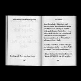
The book revisits classic book design as an arch for the exhibitions framing question for identity, fragmentation and the (in)visibility of such. With the ‘default’ mechanisms and very similar to the working process of the selected artists, the book dissolves the preconception of its own identity, by breaking with the biggest no gos in common typography.
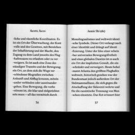
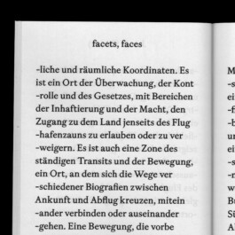
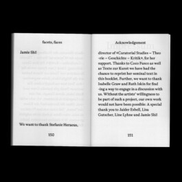
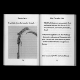
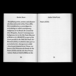

‘Widows’¹ and ‘Orphans’² and a small invention, as we call it, ‘postponed hyphenation’ are the baseline of this books design layout. It adds to the fragmentary approach of the exhibitions main theme and breaking with the stereotypes of a ‘well made’ book and simultaneously leaving the spectator with a default basic first impression. As so often, we have to look closely to realise and see our preconceptions.
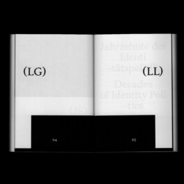
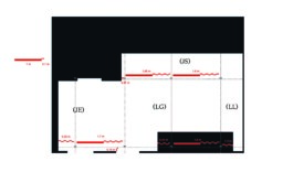
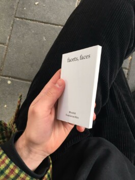
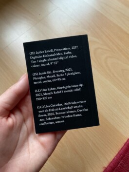
Book 74 mm × 105 mm
Spatial Design
Exhibition at fffriedrich, Frankfurt

Also look at (…)