BEA1991
An intuitive website for BEA1991 rejecting hierarchy and embracing a nonlinear, hyperlink-based navigation. Designed to reflect on BEA1991’s multidisciplinary practice, it mirrors the interwoven, free-associative logic behind her artistic world.
Website, Musician & Multidisciplinary Artist, BEA1991, Amsterdam (…)
< go back
The BEA1991 Website Design was created by CTP – Conversation Taking Place to showcase the artist’s vibrant and eclectic style through a digital platform. The website combines dynamic visuals, bold typography, and intuitive navigation to reflect BEA1991’s creative identity.
The website uses a mix of bold colors, animated elements, and unique layouts to engage visitors. This dynamic visual storytelling captures the energy and eclecticism of BEA1991’s music and artistic persona. The design emphasizes user experience with easy navigation and interactive features.
The design follows a modular system allowing flexible content updates and adaptations across devices. This approach ensures consistent brand presence whether accessed via desktop or mobile, maintaining visual coherence and functionality.
The platform integrates BEA1991’s music, videos, and visual art projects, offering a comprehensive digital portfolio. Interactive elements invite visitors to explore and experience the artist’s multidisciplinary work in an engaging way.
At CTP, we specialize in digital identities and web design tailored for artists and creatives. Our work balances aesthetic impact with usability, helping artists communicate their vision effectively online.
Explore more on CTP’s homepage or at BEA1991 - Dutch-British audio-visual artist and singer ...bea1991.comhttps://bea1991.com
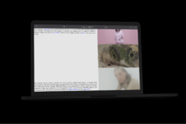
Deeply rooted in Bea’s ways of working – which means to dip her mind into everything and everywhere – this website is strictly designed to dwell around following your inner intuition. The site has no linear menu structure, as it relies on links-in-text only, intentionally connecting to Bea’s ways of working, which are always intertwined with her parallel ongoing activities.
We decided: There is no better hierarchy than the cross references of life itself, which in her case, doesn’t exactly mirror typical menu structures to comfortably navigate through content.
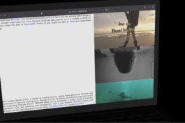
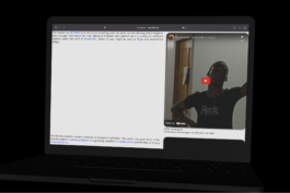
It’s a portfolio, it’s a mood board, it’s an archive, it’s a store, it’s a news page, it’s a therapy, it’s a platform.
