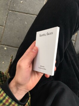
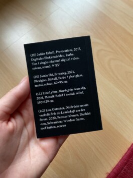
Facets, Faces
This book design disrupts conventions through typographic fragmentation —embracing widows, orphans, and delayed hyphenation— to mirror curatorial themes of identity and invisibility. Its design challenges the notion of a “well-made” book, mirroring the exhibition’s conceptual tension.
Bookdesign, Curatorial Studies, Frankfurt (…)
further links: städelschule.com
< go back

The book revisits classic book design as an arch for the exhibitions framing question for identity, fragmentation and the (in)visibility of such. With the ‘default’ mechanisms and very similar to the working process of the selected artists, the book dissolves the preconception of its own identity, by breaking with the biggest no gos in common typography.

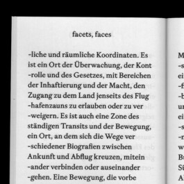

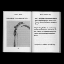
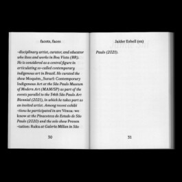

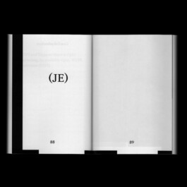
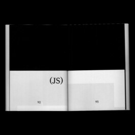
‘Widows’¹ and ‘Orphans’² and a small invention, as we call it, ‘postponed hyphenation’ are the baseline of this books design layout. It adds to the fragmentary approach of the exhibitions main theme and breaking with the stereotypes of a ‘well made’ book and simultaneously leaving the spectator with a default basic first impression. As so often, we have to look closely to realise and see our preconceptions.
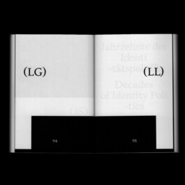
Book 74 mm × 105 mm
Spatial Design
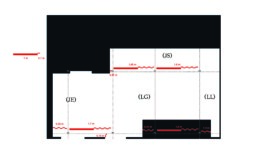
Exhibition at fffriedrich, Frankfurt

