Kazuko Miyamoto
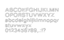
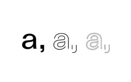
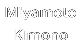
Custom type design for “Kazuko Miyamoto – to perform a line” at Japan Society New York, reinterpreting Abc Dinamo’s ‘Parma’ to echo the artist’s spatial gestures. A collaboration with Eline Mul, where typography becomes part of the performance.
Typedesign as part of Abc Dinamo, Kazuko Miyamoto, Japan Society New York City (…)
further links: japansociety.org, elinemul.com
< go back
The Kazuko Miyamoto Typedesign project was created by CTP – Conversation Taking Place to celebrate the artist’s unique approach to visual language. The work combines geometric abstraction and expressive typography, reflecting Miyamoto’s artistic legacy.
This typedesign project interprets Miyamoto’s use of grids, lines, and shapes, while incorporating typographic elements that convey movement and rhythm. The Kazuko Miyamoto Typedesign uses minimalism and repetition to evoke the artist’s style, blending precision with emotion.
The project was developed to translate Miyamoto’s visual art into a functional type system that supports communication while retaining artistic integrity.
The typeface adapts to various applications—from exhibition graphics and printed matter to digital media. Modular grids guide layout decisions, ensuring consistency and flexibility.
Typography choices emphasize clarity and readability, yet remain playful and expressive. The Kazuko Miyamoto Typedesign balances structure and freedom, echoing Miyamoto’s balance between control and improvisation.
This project not only extends Miyamoto’s visual language, but also invites contemporary audiences to engage with her work through new mediums. By bridging art and typography, it offers a fresh perspective on her legacy.
At CTP, we specialize in typographic projects that merge art and communication. If you seek to create a visual language rooted in conceptual art, we build systems that support both aesthetics and function.
Explore more on CTP’s homepage. To discover more about Kazuko Miyamoto’s work and typedesign, visit related exhibitions and archives. japansociety.org
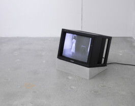
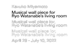
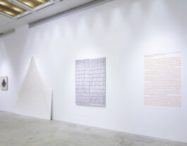
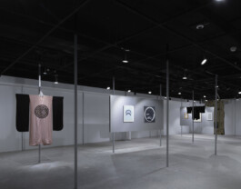
Custom Type-Design based on Abc Dinamo’s typeface ‘Parma’ for the exhibition ‘Kazuko Miyamoto – to perform a line’ at Japan Society New York City U.S., Graphic Design by Eline Mul. (Courtesy of: Japan Society)
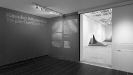


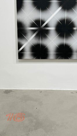
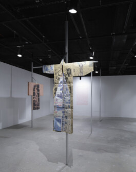

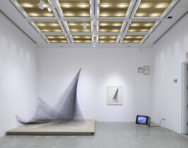
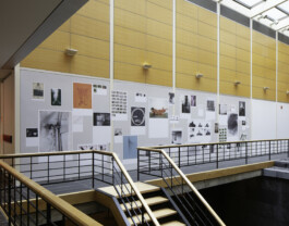
Exhibition images by Naho Kubota. Courtesy of Japan Society. Graphic Design by Eline Mul.
