Custom typeface design
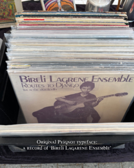
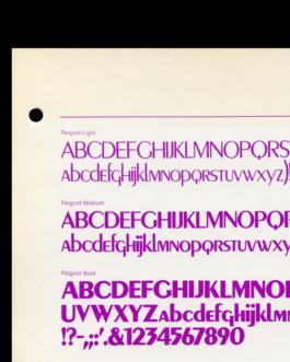
In 1937, A.M. Cassandre designed Peignot for the Parisian foundry Deberny & Peignot. No traditional lowercase. Instead, small caps with ascenders and descenders, drawn from medieval half-uncial scripts and the history of Roman inscriptions. His argument: lowercase letters were nothing more than capitals deformed over centuries by the hands of scribes. The printing press had simply inherited that deformation. The attempt: to combine the readability benefits of ascenders and descenders with the less readable approach of body text set in ALL CAPS.
Lowercase and uppercase exchange roles, ascenders and descenders remain. The eye still reads. Almost.
The response was devastating. Georges Dangon in Le Courrier Graphique, November 1937: "a text that mixes capitals and lowercase is even less readable than a text in capitals." And Henri Colas, master printer, December 1937, more bluntly: "Peignot is an error. A typeface should not be the result of a theory."
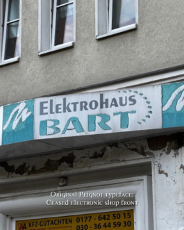
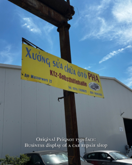
Among designers it became a joke. On the street you encounter it at the hair salon, in the window of the boutique that has been waiting for a redesign since 1994, in the mall that is slowly dying. You know it. You just no longer know why.
What got lost in all of this: the underlying system is typographically unique and has remained untouched for nearly ninety years. A genuinely interesting design concept which might just not fit the masses.
The idea: Seeing Peignot, not as a typeface, but as a unique system which is not tied to a typeface design. Applying the logic of Peignot to Times New Roman it moves further away from the desire of a ‘modernisation’ or ‘revolution’ of typography. The most recognised typeface in the world forced into a system that did not exist before. Peignotised. More on that soon.
Custom Typface Design, Matthias Gschwendtner (…)
further links: matthiasgschwendtner.com
< go back
Also look at (…)