Reidar Mester
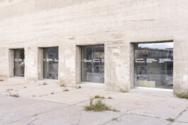
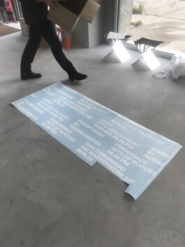
A spatial concept and digital campaign for Reidar Mester’s solo show at San Gimignano Berlin. A custom typeface echoes the material precision and quiet wit of his sculptural language, while repetition becomes a structural tool, mirroring his architectural logic and obsessive craft.
Digital Campaign & Spatial Design, Reidar Mester ‘Phosphenes’, San Gimignano Berlin (…)
further links: reidarmester.com bplus.xyz
< go back
The Design and Social Media Concept for Reidar Mester was developed by CTP – Conversation Taking Place, an independent Berlin studio. This project combines a cohesive visual identity with a strategic social media plan, because building a strong brand presence online requires clarity and consistency therefore it aims to strengthen Reidar Mester’s brand across multiple digital channels, while ensuring that every touchpoint communicates the core values of his architectural and product design practice.
Blending architectural and product design aesthetics, the concept features modular grids, clear typography, and restrained colour palettes. These elements work together so the visual identity serves as a reliable foundation for all social media content, which helps ensure consistent branding and clear message delivery.
Since Reidar Mester’s work spans diverse disciplines, the Design and Social Media Concept for Reidar Mestersupports application across platforms—from Instagram and LinkedIn to digital portfolios and marketing materials. the brand remains coherent, therefore, even when communicated through various formats.
CTP developed modular templates to facilitate flexible content creation, including social media posts, stories, and digital portfolios. These templates integrate photography, typographic overlays, and messaging aligned closely with Reidar’s design philosophy.
The content needs to appeal to audiences interested in both architecture and product design, the strategy balances professionalism with approachability. It also maintains a strong visual identity.
While creating the concept, we considered user engagement carefully, so posts are designed to attract interaction and foster community growth. Additionally, content schedules and formats were optimized for reach.
Focusing on narrative storytelling and visual clarity, the social media concept attracts and engages a target audience interested in design innovation. Visual elements such as colour accents, typographic hierarchy, and image framing highlight key messages, while post schedules and formats maximize reach and interaction.
Although the aesthetic is clean and minimal, the concept uses dynamic layouts to keep the audience visually engaged without overwhelming them. Moreover, we integrated feedback loops to adjust content dynamically.
Throughout the project, CTP collaborated closely with Reidar Mester’s team to align the identity and social media plan with his broader business goals. As a result, the final concept provides not only tools for ongoing brand development but also effective digital presence management.
By integrating both design and strategic communication, the concept offers a robust platform to support Reidar Mester’s growth in the digital sphere. It is flexible enough to evolve with future needs and changing platforms.
Explore more on CTP’s homepage. To see Reidar Mester’s work and social media in action, visit reidarmester.com.


Spatial Concept and Digital Campaign for Reidar Mester’s solo show at San Gimignano Berlin.

The typeface being a custom designed element revealing a much more detailed perspective on how the objects are made, just as much as, revealing a hidden humorous touch inherited by the designers creations.


Repetition is being used as one of the key elements mirroring Reidar’s working methods and design approach to his distinct architectural products.


Also look at (…)