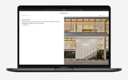
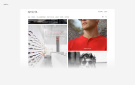
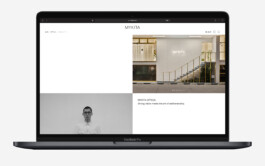
For MYKITA’s digital presence, we rethought the use of typography and designed a modular landing page system. Full and half-bleed layouts meet a fading menu—creating a calm, contemporary interface that lets the content breathe beyond conventional catalogue logic.
Web-Design, MYKITA, Berlin (…)
< go back
The Mykita Website Design was created to showcase the brand’s innovative eyewear through a modern e-commerce platform. Developed by CTP – Conversation Taking Place, the website combines sleek visual identity with seamless user experience, providing customers with intuitive navigation and detailed product presentation.
The design of the Mykita Website Design prioritizes user-friendliness and aesthetic appeal. The clean layout features high-quality images and streamlined menus, making browsing effortless. Moreover, the responsive interface ensures that the website functions flawlessly across desktop, tablet, and mobile devices, which enhances customer engagement.
Mykita’s brand values are communicated through a minimalist and contemporary visual identity. The website uses a monochrome palette with subtle accents, allowing the eyewear designs to stand out. This visual strategy supports the brand’s reputation for combining craftsmanship with cutting-edge technology.
The Mykita Website Design integrates detailed product pages with rich descriptions and multiple images. Customers can interact with 360-degree views and filtering options to find the perfect eyewear. This functionality improves the shopping experience by making information accessible and engaging.
At CTP, we specialize in designing e-commerce websites that balance aesthetic quality with practical functionality. Our approach ensures that brands like Mykita can effectively communicate their identity and engage customers through well-crafted digital platforms.
Explore more on CTP’s homepage. Learn more about Mykita at mykita.com.
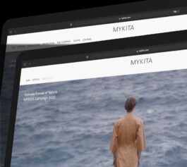
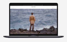
For MYKITA’s digital redesign of their online environment, we helped rethinking their use of typography throughout the site, and designed a new landing page to meet their brands set out goals with a contemporary appearance.
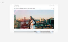
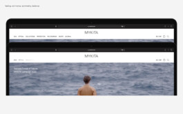
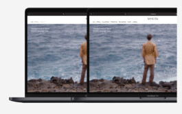
We developed a design concept consisting of half and full bleed content modules, reacting to the various content requirements with a daringly designed menu.
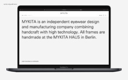
A fading menu to create the utmost balance highlighting the content and stepping aside from aggressive ‘all at once product catalogue’ marketing.

Also look at (…)